Logo
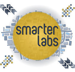
The SmarterLabs logo was designed to represent the project in one recognizable image. It is based on a city structure in the background that is covered by a round figure symbolizing a Living Lab respectively a 'smarter' lab. The four arrows refer to the project’s two main focuses as well as the project design itself:
The dotted arrows pointing towards the Living Lab symbolize the heterogeneity of stakeholders who are all supposed to be part of a Living Lab process and actively contribute (participation, social inclusion). The colored dots also show the variety of partners who are involved in the project including academic institutions, cities and private and business organizations.
The blue arrows represent upscaling, meaning to extend Living Labs and their results to a larger scale which is often difficult in socio-technical systems. The arrows also indicate the mutual knowledge and experience exchange between cities in the project and finally the promotion of a smarter Living Lab concept (guidelines).


